design
Clean + Clear
No matter the subject, my goal as a designer is always the same:
a clean design with clear messaging.
west alabama voices echoing success
PURPOSE: PROMOTE
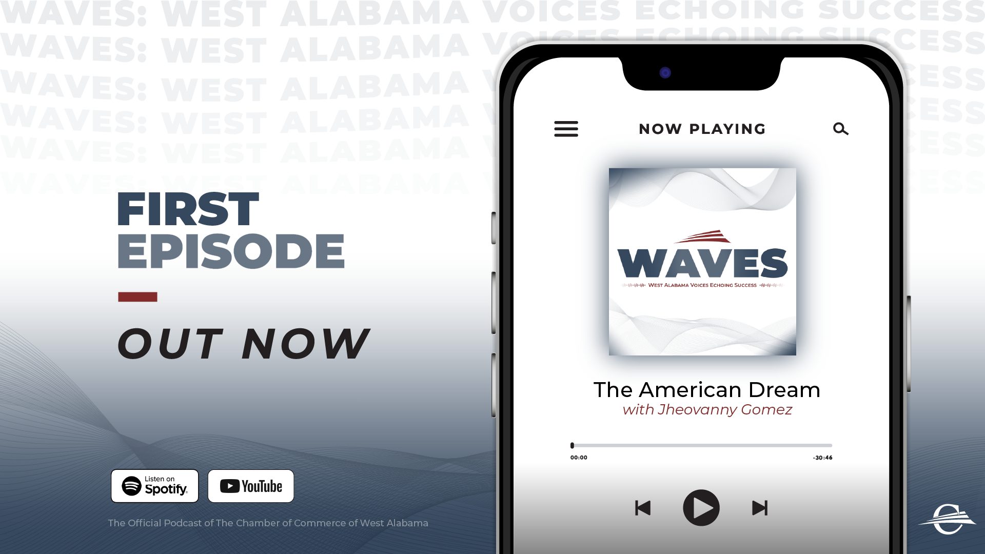
This graphic has the podcast name repeating in the background, progressively fading to visually represent an echo. The echoing text also follows a subtle wave pattern, reinforcing the podcast's name while creating a sense of movement. Flowing lines spanning the bottom resemble traditional audio sound waves, further emphasizing the podcast's connection to sound, voices and storytelling. The phone serves as a familiar visual reference, while the Spotify and YouTube logos communicate where audiences can access the podcast, making the promotion both functional and professional.
Tuscaloosa Fire Rescue
PURPOSE: RECRUIT
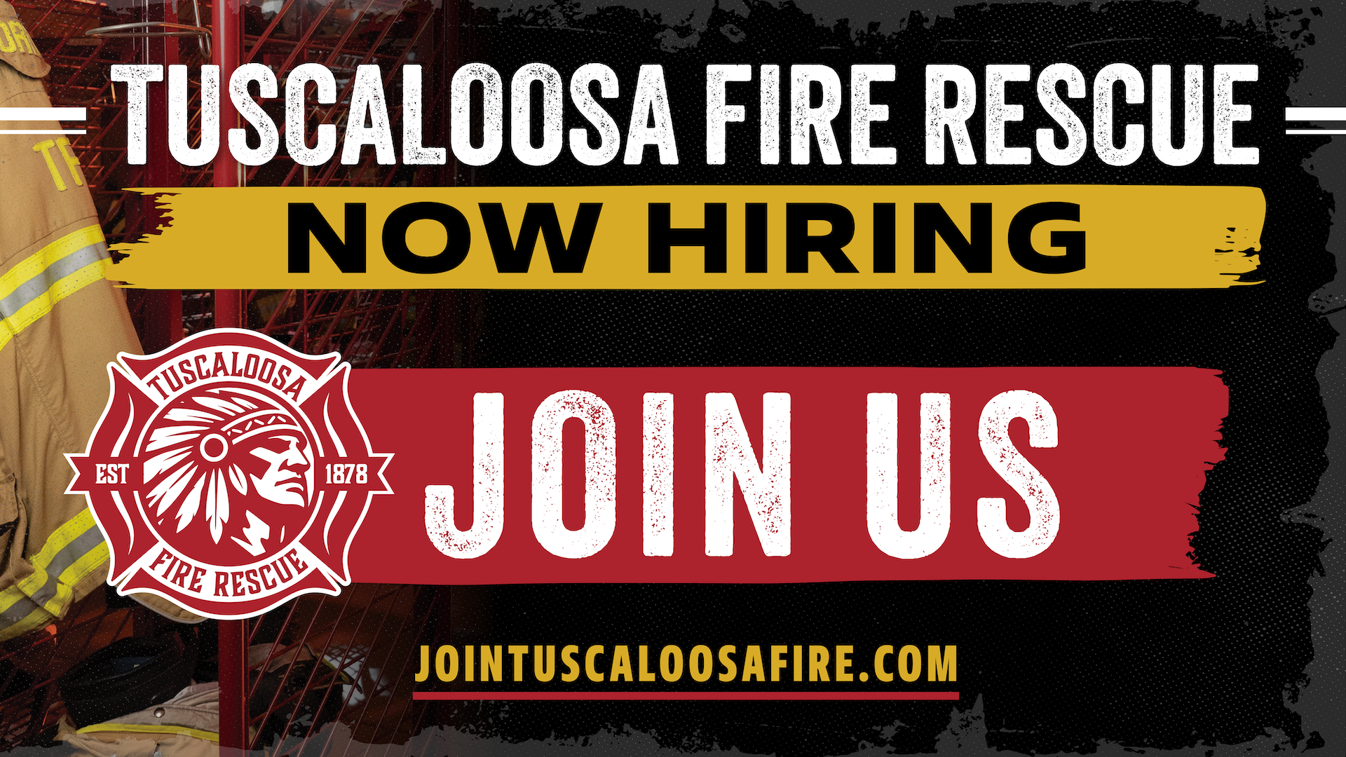
This recruitment graphic features a bold, gritty aesthetic that reflects the nature of firefighting. A blackened background, smoky gray edges and distressed elements add depth and dimension, while rough brushstrokes and bold typography evoke intensity. Together, these elements create a rugged, striking design that commands attention and visually represents the firefighting profession.
strawberry fest
PURPOSE: PROMOTE
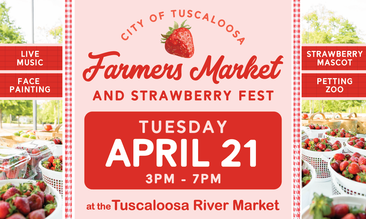
This design embraces a bright, cheerful aesthetic that captures the freshness and excitement of springtime. A vibrant red and soft pink color palette was chosen to reflect the natural color of strawberries. Photos of fresh strawberries and the outdoor market setting frame the design, visually communicating the focus of the event. A decorative gingham border brings in a classic picnic-inspired pattern, further emphasizing the seasonal, farm-fresh theme. The event date and time are featured prominently in a bold red panel to make essential information easy to locate at a glance, while smaller side panels showcase additional attractions. Overall, the layout balances playful personality with clear visual hierarchy, creating an eye-catching promotional piece.
Before
Before
stormwater pollution
PURPOSE: EDUCATE
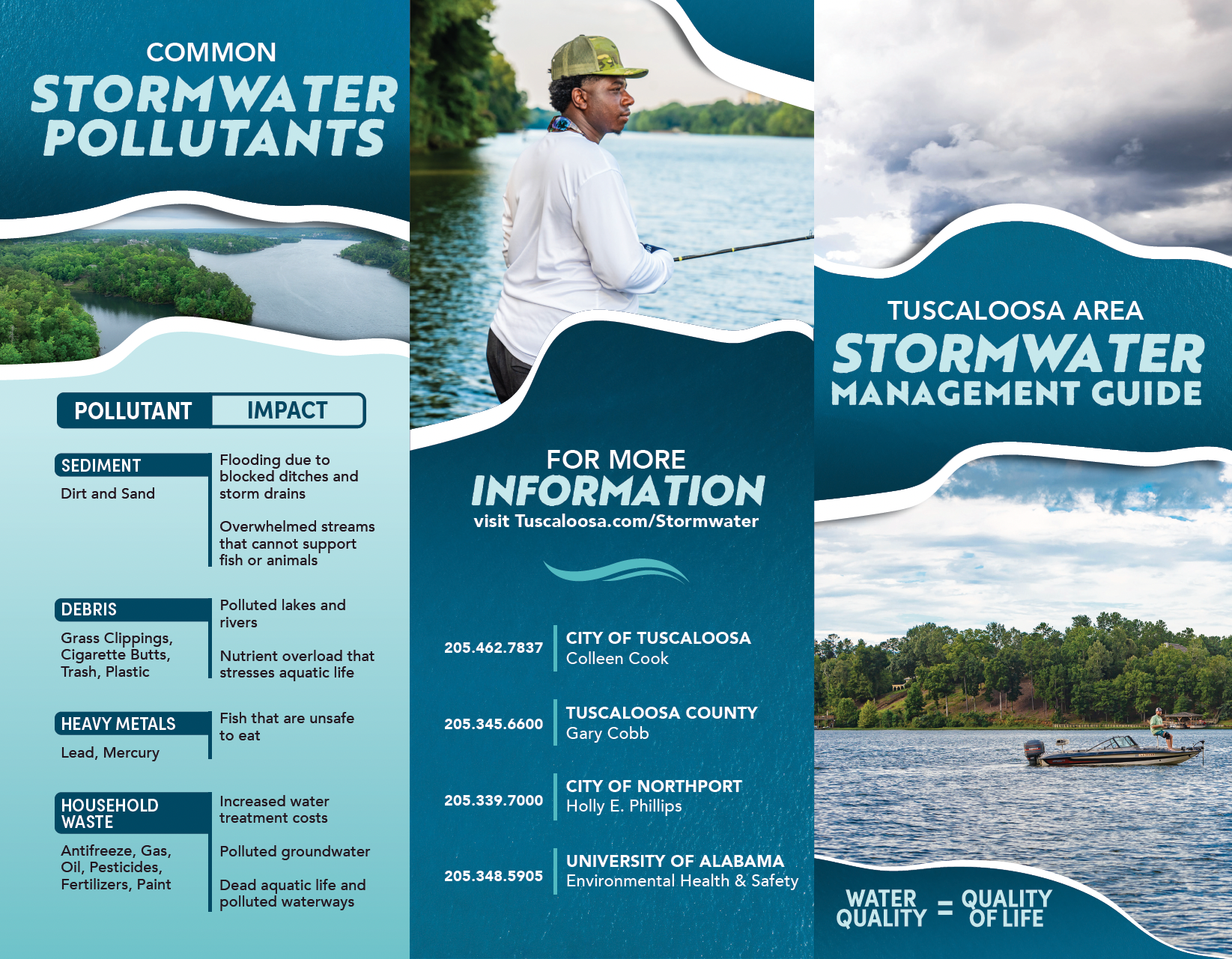
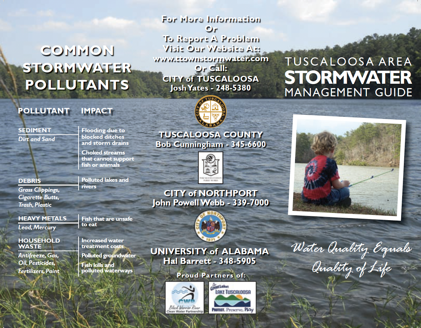
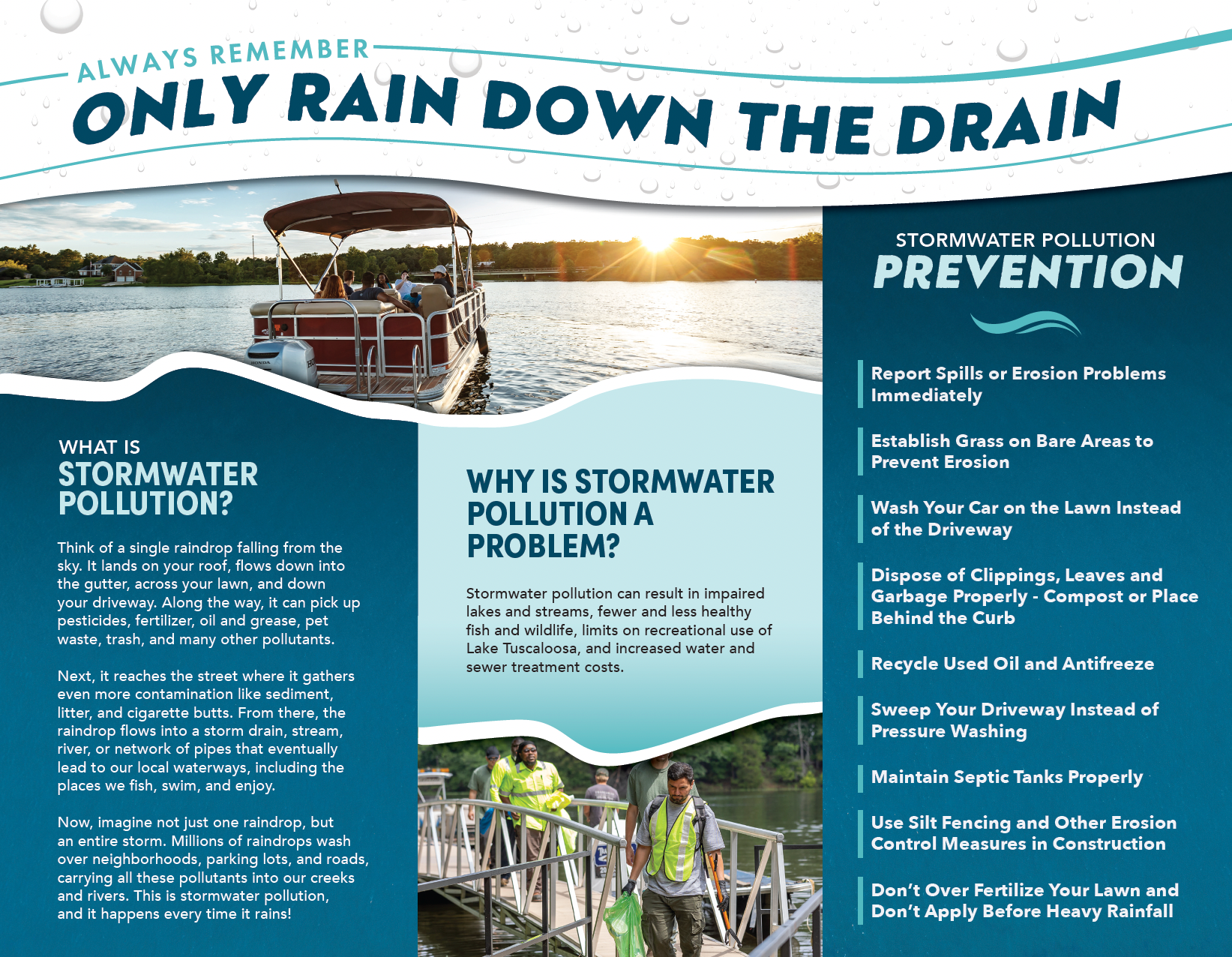
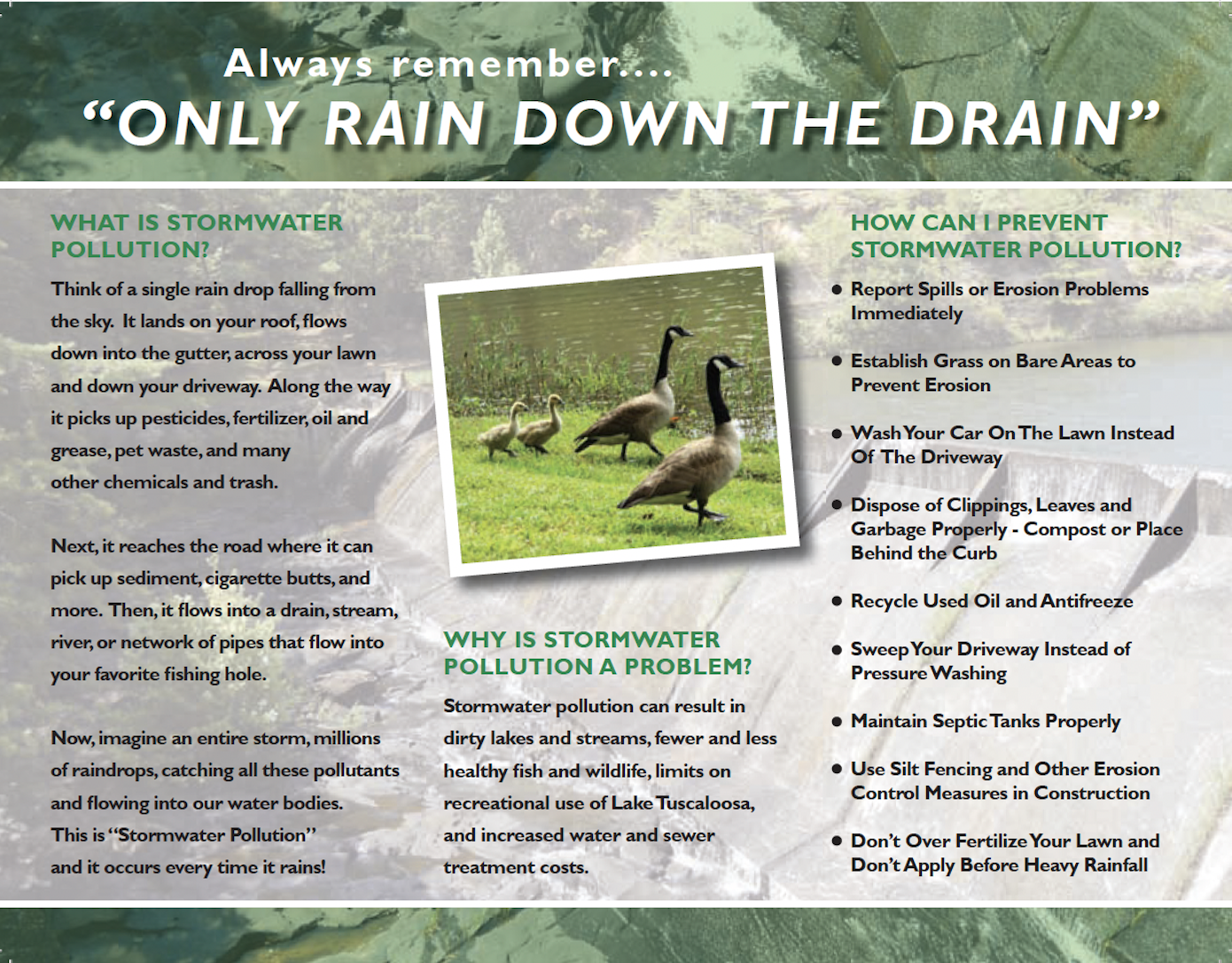
This redesigned brochure transforms the previous version into a more modern, visually engaging form of public communication. With virtually the same content presented across the same panels, this project is a great example of how thoughtful design can completely change the look, feel and impact of a piece without changing the information itself. Because this was an initiative-focused project rather than an established brand with existing guidelines, I had the creative freedom to develop the visual direction from the ground up. Blue was an obvious choice for a project centered on water, but I incorporated teal to add a hint of green, a color commonly associated with environmental initiatives. Water isn't flat or one-dimensional, so I used color gradients to create depth, giving the design a more realistic, water-like feel. Wave-inspired shapes add movement throughout the layout while reinforcing the subject matter. The layout balances imagery and information, breaking up dense content into more digestible sections. Local photography further connects the message to the community, showing how stormwater quality affects the places and activities around us. The result is a more polished, approachable brochure that makes an important message easier to understand.
