POST-IT
BACKGROUND
As part of a creative project, I rebranded a company. By the completion of this rebrand, I had created a new logo, a brand book, a dynamic mood board, and more. The company I chose was Post-It because I probably go through one set of sticky notes each month — I’m not kidding. Although Post-It now offers a wide variety of office and school products, I wanted to focus on sticky notes, which marked the beginning of the brand’s history in 1968.
BEHIND THE DESIGN
Along with the standard black and white, I chose five colors for the color palette that are the most common sticky note colors. The book is also square-shaped, like a sticky note. Check out the toggles below for a detailed step-by-step process before I moved into the book’s creation. You can also watch the dynamic mood board on my videography page.
RESEARCH
As with any project, the first step is always research. I needed to find out what problem(s) Post-It solves and what makes Post-It different from other companies to understand the brand thoroughly. I visited their website and social media outlets to get a feel for their current branding, understand how they operate, learn their history, and ultimately decide how I wanted to go about the rebranding.
LOGO DESIGN
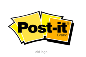

A company’s logo is the foundation of its brand identity, so it only made sense to start the design process with the logo. As seen above, the two old logos featured multiple sticky notes in shades of yellow.
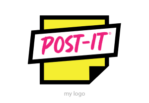
I used a single, bright yellow sticky note with a handwritten font in the new logo. Using elements (the sticky notes and the colors yellow and black) from the two older logos in the new logo design maintains the trust between the brand and its existing customers.
Using elements from the old logos in the new logo shows existing customers that Post-It is not abandoning its entire branding but modernizing to stay current on trends in today’s digital society. I was inspired to go modern with the new logo because of the Post-It app’s launch in 2019. I also wanted to ensure the new logo would work on the square shape of the app’s icon.
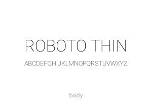
TYPOGRAPHY
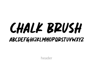
Header – Chalk Brush: I chose a thick, handwritten font to emulate the writing of a Sharpie marker that people often use when writing on sticky notes. Because this is a decorative font, It is best suited as a header font because it could interfere with legibility as a body font at a smaller point size.
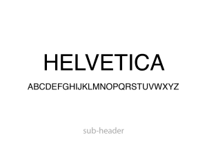
Sub-Header – Helvetica: I chose a simple, sans-serif font that would contrast nicely with the display font I chose for the header.
Body – Roboto: I used another sans-serif font considerably thinner than the sub-header font to distinguish the two fonts clearly.
CONTACT ME
Have a question? Let me know!